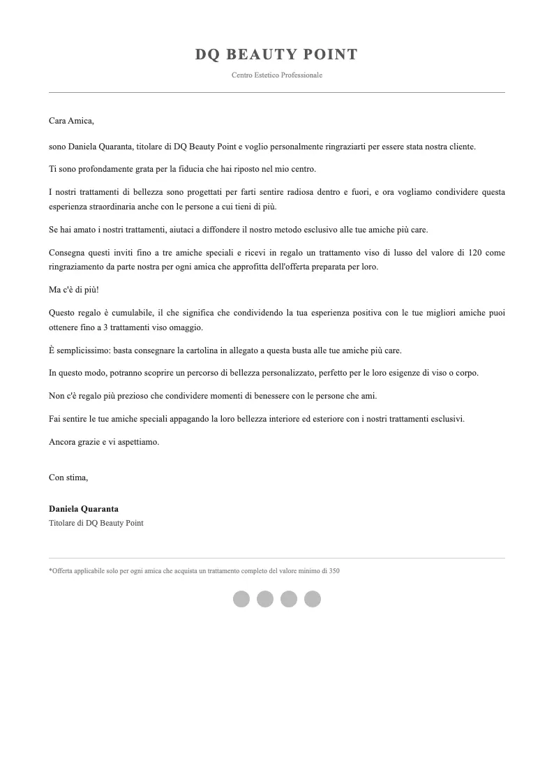
Postcard
For DR copywriters, publishers, and agencies who own the conversion number.
A field checklist for spotting the layout choices that kill response, before the piece goes to print. Free PDF. No course, no webinar, no upsell.
One email. PDF in your inbox in under a minute. Unsubscribe in one click.
Chief Design Officer for 3 years at Metodo Merenda, one of Italy's largest direct response companies. 350+ campaigns shipped.
Proof of concept
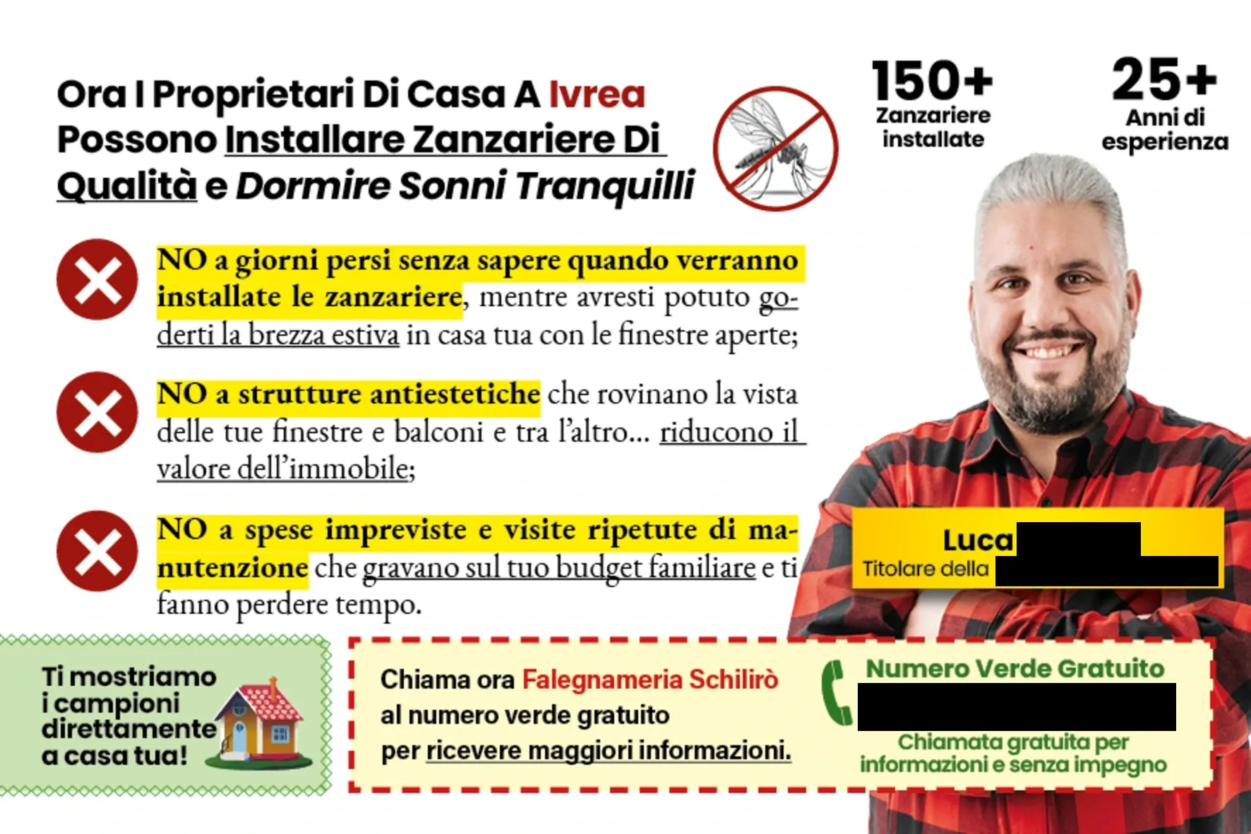
The copy didn't change. The layout did. Here's what that looks like on three common DR formats.
Postcard
Sales letter
Magalog
The problem
You have seen this happen. Pick the one that stings.
The headline that tested well shrinks to 60% of its size because "it looked cluttered." Response drops. Nobody runs the post-mortem.
The P.S. you worked three drafts on ends up floating in a grey box, two font sizes smaller than the body, with no signature above it. The reader never gets there.
The designer centers everything. Eye-flow collapses. The lead reads the last line first and bounces.
The copy is fine. The layout betrayed it. And because the piece "looked professional," nobody blamed the design.
This checklist names the 13 patterns, so you can flag them before they ship.
What's inside
Print formats only: magalog, sales letter, direct mail, brochure, flyer.
Single block body copy, no visual rest points.
Stock imagery or generic hero that signals “advertisement” in the first half-second.
11pt, low-contrast, tucked at the end.
Styled like body text instead of a stopper.
Oversized top-left, “who paid for this” vs “what's in it for me”.
+ 8 more sabotages inside, including the one that quietly destroys the lift-note on every sales letter.
The PDF ends with a one-page scorecard. 13 checks, pass or fail, with the fix noted. Under 4 minutes on any piece.
Proof
Numbers measured by the clients.

11.14% response rate
Fold-out invite for a bar launch, mailed to a cold local list.

37 qualified leads
DRD trifold redesign for a B2B service.

50% scan rate
Printed brochure with QR code, scanned by half the people who received it.
Three pieces, three verticals, one constant: the design did not fight the copy.
Testimonials
Endorsements from Italian DR copywriters and operators who ran the work against their own controls. US testimonials will follow as American clients ramp up.
"The only one in Italy I trust with my clients' work. His ability to elevate my words is impeccable."

Daniel Porro
Copywriter
"In two weeks of pre-launch I almost reached break-even. Davide combines design and strategy."

Nicola Serafini
Senior Copywriter
"I couldn't imagine entrusting my materials to any other designer in the world."

Fabrizio Marino
3D4Steel
Why this works
This work comes out of the Italian DR market, where:
No public benchmarks exist. Promos test blind. If the piece does not pull, you find out on the reply form, not on a dashboard.
There is no Agora-scale volume to absorb sloppy design. Every layout decision has to carry its own weight.
The culture is relationship-first. Overclaim once and you lose the client and the three they would have sent you.
Principles that survive there do not soften on a US list. If a layout works here, it does not weaken when it crosses the Atlantic.
Fit check
This is for you if
You are a DR copywriter and your work ships on paper: sales letters, magalogs, direct mail, lift notes.
You are a marketing manager at a publisher and you sign off on print creatives every week.
You run an agency where the designer and the copywriter do not speak the same language.
Not for you if
You run a brand agency and "direct response" sounds dated to you.
You lead a creative direction team and your KPI is aesthetic consistency, not reply rate.
You only ship digital and have never mailed a piece.

About Davide
Davide Filippini. Designer for direct response copy, not for decoration.
Three years as Chief Design Officer at Metodo Merenda, one of Italy's largest direct response companies. 350+ full campaigns shipped across print and digital: magalogs, sales letters, direct mail, landing pages.
Now at Keryx Design, where the designer is accountable for the same number the copywriter is: response.
Work disguised as editorial, not as ads.
FAQ
Download
One PDF. 13 sabotages. One scorecard you can run on any piece of print DR before it goes to print.
In your inbox in under a minute. One-click unsubscribe.
P.S. This landing page was built using the 13 principles inside the checklist. If it held your attention this far, the checklist holds together.