
Direct Response Design:
the discipline of making people actually read your copy.
DRD is not a service. It’s an approach to design where every visual choice exists for one reason: to get your message read, understood, and acted upon.
Your design is working against your copy.
You invest thousands in copywriting. A sales letter that took weeks. A landing page rewritten four times. An ad with the perfect hook.
Then a designer wraps it in a light-gray, 14px font on a white background. Or buries the call to action below a decorative photo that says nothing. Or picks a typeface because it “looks modern” instead of because it’s readable at a glance.
The result: people scroll past. They don’t read. Not because the copy is bad, but because the design made it invisible.
DRD is to copy what acoustics is to music. You can have the greatest concert in the world, but if the room swallows the sound, nobody hears it. Great copy inside bad design is exactly that: a message that never lands.
So what is Direct Response Design?
Direct Response Design is the discipline of designing every visual element to serve readability, bypass advertising defenses, and drive the reader toward action.
It is not a type of service. It is a lens. A set of principles refined over 50 years of American direct mail, where every design choice was measured in sales, not applause. You apply DRD to anything: a website, a book, a flyer, a logo, a sales letter, an email, a package.
Make the copy get read.
Typography, spacing, contrast, hierarchy: every choice is engineered so the reader’s eye flows naturally through the message. No friction. No guesswork. The design disappears, and the words do their job.
Bypass the reader’s defenses.
People have been trained to ignore advertising. A piece that “looks like an ad” gets discarded before a single word is read. DRD structures materials so they feel like content worth reading, not promotions worth ignoring.
The tools
The concepts behind every choice.
Not aesthetic preferences. Tools sharpened over decades of testing, each with a payoff you can measure.
Eye flow
The path your eye travels across the page before it reads a single word. A Direct Response Designer doesn't inherit that path. He builds it, with contrast and white space, like road signs pointing to the action.
On a screen people scan before they read (Nielsen Norman Group).
Visual hierarchy
Deciding what the reader sees first, second, third, and making sure the last thing is the button. Nothing on the page is an accident.
Emphasize everything and you've emphasized nothing.
Readability
Two separate jobs: decoding the letters, and wanting to keep going. Line length near 66 characters, line height of at least 1.5, text set flush left, and never a hairline-thin typeface.
Backed by typography and eye-tracking research.
Johnson box
The block of text boxed at the very top of a letter, above the greeting, built to pull you into reading. Today it lives in your email preheader.
Frank Johnson, Time Inc., 1941.
Deck copy
The text that sits between the headline and the body: the second door, the one that turns attention into interest and reels the reader in.
Copy cosmetics
The graphic touch-ups that lift readability and steer the eye to the lines that make people respond, without changing a single word of the copy.
Underline everything and you've underlined nothing.
I've gathered 21 of them in a resource of their own.
Visual hammer
One simple, repeated image that drives the positioning into memory with emotional force.
A concept from Laura Ries.
Invisible design
If someone looks at the page and says “beautiful design,” the design just stole attention from the message.
You never notice great DRD.
Two different philosophies.
| Traditional Design | Direct Response Design | |
|---|---|---|
| Goal | Look good | Get read and convert |
| Font choice | Based on aesthetics | Based on readability data |
| White space | Decorative | Functional (guides the eye) |
| Hierarchy | Often inverted | Engineered for action |
| Success metric | "The client likes it" | Conversions and read-through rates |
| Imagery | Mood-driven | Purpose-driven (supports the copy) |
| The designer's question | "Does it look right?" | "Will it get read?" |
The proof
It has worked for over a century.
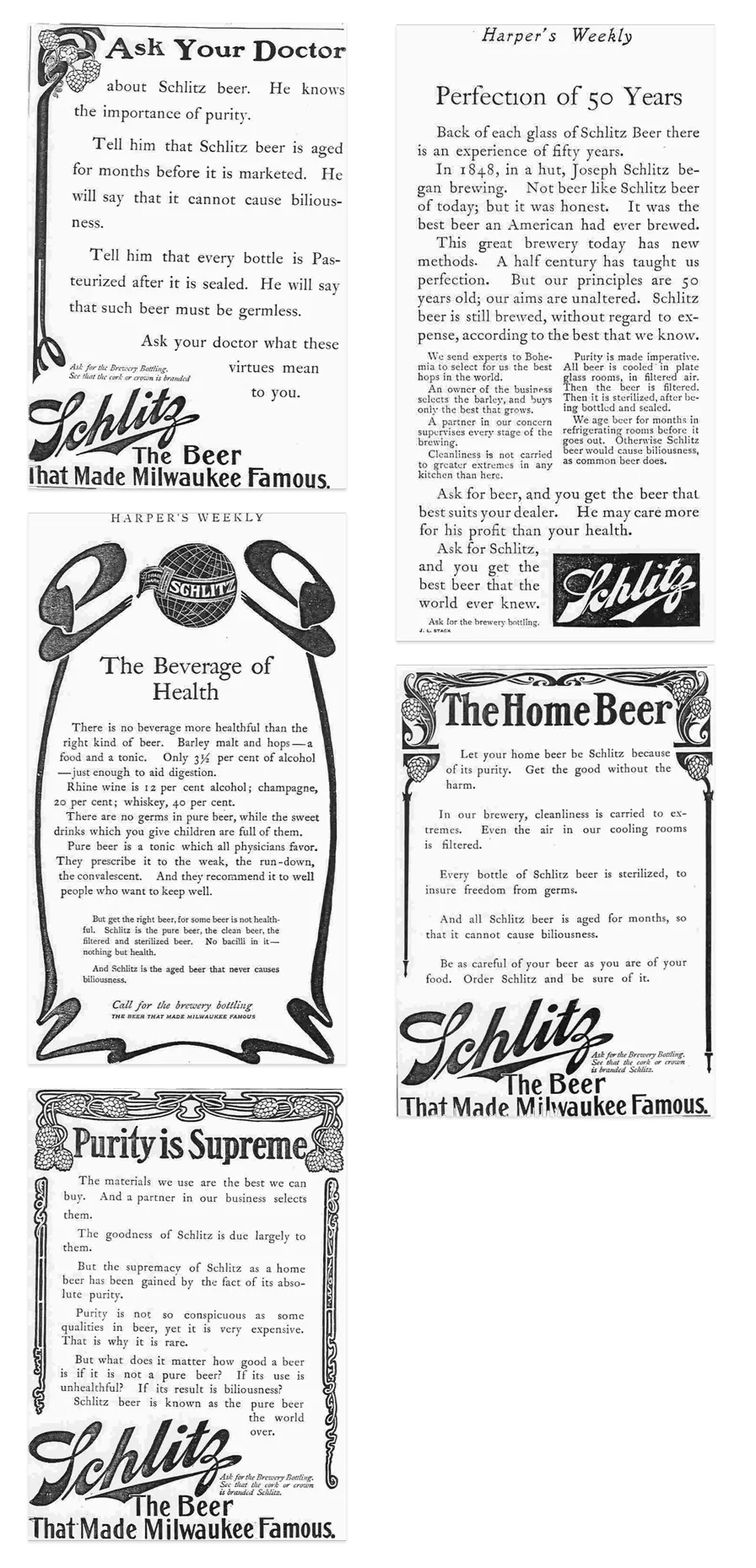
Schlitz: be the first to say what everyone already does.
A beer stuck in the middle of the pack. Instead of shouting "pure" like every other brewer, Hopkins walked the plant and wrote down how the beer was actually made: live steam cleaning every bottle, air filtered through cotton, water pulled from wells dug deep below the city. Every brewer did the same things. Nobody had ever bothered to tell the story.
You don't have to be different. You have to be the first to say it.
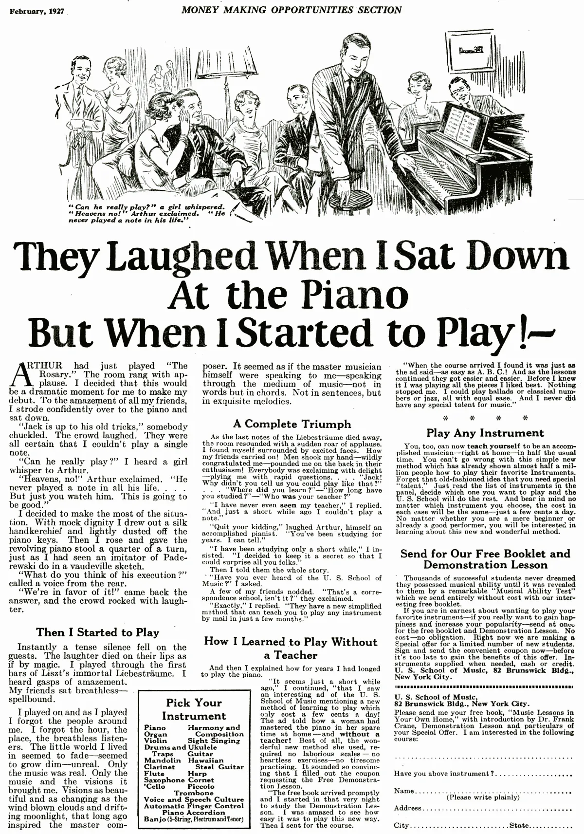
Caples: people don't buy the piano, they buy the moment they silence the room.
A piano course sold entirely by mail. The headline never mentions the piano. It tells the story of a man everyone laughed at, until the second he started to play. The headline sells the transformation the reader is after. The product itself barely gets a line.
It became one of the most imitated ads ever written.
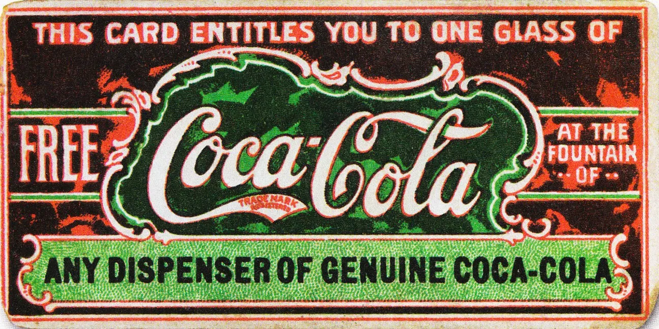
Coca-Cola: open by giving something away first.
The first coupon in advertising history: a ticket for one free glass of Coca-Cola. Between 1894 and 1913, roughly 8.5 million of them were redeemed.
Give people a concrete reason to respond, with a mechanism you can actually track, and it still works a century later.
The roots
A discipline a century in the making.
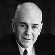
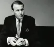
I didn't invent this. It stands on the shoulders of people who measured every choice in sales, not in awards.


Not limited to one format. Applied to everything.
If it has text and needs a response, DRD makes it work harder.
See DRD in action.
Theory is useful. Results are better. Browse our portfolio to see how Direct Response Design transforms real projects for real businesses.